Charts and graph in statistics
The statistical data in statistics is shown by charts, diagrams, and graphs for getting quick information. Charts and graphs of statistical data are catchy and time saver for collecting the information. The charts and graphs of statistics give us full information about the statistical data at a glance. The statistical charts are also known as pictographs. There are a number of ways of showing charts and graphs in the statistics. Here in this site, you are going to get the knowledge about all types of charts and graphs in statistics. These charts and graphs of statistics are widely used in science, maths, economics, political science, social science, and in media. Before we start the topic types of graphs in statistics, first we have to discuss some of the statistical terms as follows.
You can study here charts and graph in statistics,definition of statistics,application of statistics,difference between raw data and organized data,frequency distribution table,types of statistical data,individual series,descreet series,continuous series,class mark,commulative frequency,graphical representation of the data,bar graph,pie chart,histogram,frequency polygon,ogive,simple bar diagram,subdivided bar diagram,percentage bar diagram.

Click for online shopping
Future Study Point.Deal: Cloths, Laptops, Computers, Mobiles, Shoes etc
NCERT Solutions Class 10 Science from chapter 1 to 16
Definition- Statistics is the science of collecting, organizing, presenting, analyzing, and interpreting numerical data for the purpose of assisting in making an effective decision.
Application- The use of statistical data is executed in making the decision as after the extraction of the data. Statistics is used in the field of finance, economics, commercial field, business, science, etc.
It is mostly used in managing the government allocation of the budget in different fields and in the company’s sales, purchases, profit, loss, and predictions.
Charts and Graphs used in Statistics
Data– Data is the collection of facts and figures of information such as the name of students, marks obtained by the students, the population of a country, temperatures of days within a weak of a particular place, etc. Data is of two kinds
Raw Data- The unorganized data is known as raw data as an example the marks out of hundred of few students are given bellow.
45, 70, 60, 30, 45, 75, 80, 98,56, 30,70
Organized data – The data is formed by extracting the raw data to make it meaningful is known as organized data.
The above raw data is arranged in the following way
| Marks of students | Number of students |
| 45 | 2 |
| 70 | 1 |
| 60 | 2 |
| 30 | 1 |
| 75 | 1 |
| 80 | 1 |
| 98 | 1 |
| 56 | 1 |
Frequency of data- The number of times a particular quantity repeats in a given data is known as the frequency of the data. As an ex. In the above-mentioned data 45 is repeated two times so, the frequency of observation 45 is 2.
Frequency distribution table-This is an organized form of data in which the quantity and corresponding frequency is also mentioned.
Type of statistical data –The statistical data is collected from different sources through experiments, surveys, and analyses.
There are mainly two types of statistical data based on the sources wherefrom it is taken
- Primary statistical data
- Secondary statistical data
The statistical data is classified into two types based on the extent of values of the quantity
- Qualitative statistical data
- Quantitative statistical data
Primary statistical data- Primary data is the data which is obtained by the investigator or researcher by the method of direct interview, surveys, and experiments on which statistical operations have not been applied. As an example, the decimal census collected by directly surveying door to door.
Follow us on Pinterest
Click here to follow us on pinterest
Secondary statistical data – Secondary statistical data is the data that is collected from other sources like Indian statistical organizations, ministry or another department. The secondary data is also collected from the magazine and newspaper. This is the data on which statistical operations are done for making a decision.
Qualitative statistical data –The qualitative statistical data is represented by words only, as an example chapter of a book, observation of things good, bad, worse, etc.
Quantitative statical data –The Quantitative statical data is represented by the numerals, as an example the weights of 5 students, marks of 6 students, etc.
The series of statistical data is classified into three types
Individual series –The series of statistical data in which observation is given without showing their frequencies. As an example the weight of 5 persons given bellow.
68 kg, 50kg, 70kg, 80kg, 50kg
Discreet series –The series of the data in which observations are shown with their corresponding frequencies.
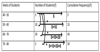
Continuous series – The statistical data is given in the form of intervals. As an example, the marks of 50 students in a test is given below. It is also called grouped frequency distribution.
| Marks of student | 40 – 50 | 50 – 60 | 60 – 70 | 70 – 80 |
| Number of students | 5 | 10 | 30 | 5 |
Limits – In the class interval 40 – 50, the lower limit is 40 and the upper limit is 50
Class Mark- The midpoint of the class interval is known as the class mark, the class mark of the class interval is calculated as follows.
Cumulative Frequency –The cumulative frequency corresponding to observation is the sum of previous frequencies. As an example cumulative frequency of the above data is given below.
Graphical Representation of the data – The representation of the data through diagrams helps us to visualize the whole meaning of the distribution of frequencies of observations at a single glance. There are various means of representing the data by means of graphs.
- Bar Graph
- Pie Chart
- Histogram
- Frequency Polygon
- Ogive
Bar Graph –It is the simplest way of representing the numerical data in the form of bars of equal width, the space between the consecutive bars must be the same. The height of the bar shows the value of observations. The numerical data can be represented by the following types of bar diagrams, depending upon the type of data.
Simple bar diagram- When observations are of the same type of data is of single variable then it is better to represent the data by bar diagram. It can be understood by the following example.
Table
| Games | Table Tennis | Volleyball | Hockey | Basket Ball | Cricket |
| No of students | 500 | 300 | 350 | 400 | 550 |

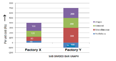
Subdivided bar diagram- Draw a suitable diagram to represent the following information
|
Factory
|
Selling price per unit (in Rs)
|
Quantity sold
|
Cost of components | |||
|
Wages |
Material |
Miscellaneous |
Total |
|||
| X | 400 | 20 | 3200 | 2400 | 1600 | 7200 |
| Y | 600 | 30 | 6000 | 6000 | 9000 | 21000 |
Show the profit and loss also.
We are destined to show expenditures per unit of the item by both the factory. Before we show the above data, let us calculate the cost of wages, material, and miscellaneous per unit of the item.
In case of factory X, total sale of 20 units = 20 × 400 = Rs 8000 and total cost of 20 units =Rs 7200
In case of factory Y,total sale of 30 units = 30 × 600 = Rs 18000 and total cost of 20 units = Rs 21000
| Factory X (20 units) | Factory Y (30 units) | |||
| Total cost (Rs) | Per unit cost | Total cost | Per unit cost(Rs) | |
| Wages | 3200 | 160 | 6000 | 200 |
| Materials | 2400 | 120 | 6000 | 200 |
| Miscellaneous | 1600 | 80 | 9000 | 300 |
| Profit/Loss
(8000 −7200) |
800
(8000 −7200) |
40 | −3000
(1800 – 2100) |
−100 |
Negative sign shows the loss
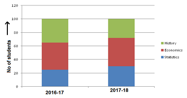
Percentage bar diagram- Represent the following data by a percentage bar diagram.
| Subjects | Number of Students | |
| 2016-17 | 2017-18 | |
| Statistics | 25 | 30 |
| Economics | 40 | 42 |
| History | 35 | 28 |
Solutions. Calculating the percentage of the students related to each subject
| Subjects | 2016-17 | 2017-18 | ||
| No of students | % of students | No of students | % of students | |
| Statistics | 25 | 25 | 30 | 30 |
| Economics | 40 | 40 | 42 | 42 |
| History | 35 | 35 | 28 | 28 |
| Total | 100 | 100 | 100 | 100 |
Pie Chart- The following are the data about the market share of four brands of TV sets sold in Panipat and Ambala. Present the data in the pie chart.
| Brand of sets | Units sold in Panipat | Units sold in Ambala |
| Samsung | 480 | 625 |
| Akai | 360 | 500 |
| Onida | 240 | 438 |
| Soni | 120 | 312 |
Solution.
Total sets sold in Panipat and Ambala are 1200 and 1875 respectively. Data are to be represented by two circles whose radii are in the ratio of square roots of total TV sets sold in each city in the ratio of 1: 1. The calculation of the angle of sector corresponding to sales of each brand is given bellow.
|
Brands of sets |
Panipat | Ambala | ||||
| Sets sold | Sales (Rs) % | Angle of sector | Sets sold | Sales (Rs) % | Angle of sector | |
| Samsung | 480 | 40 | 625 | 33.3 | ||
| Akai | 360 | 30 | 500 | 26.7 | ||
| Onida | 240 | 20 | 438 | 23.4 | ||
| Soni | 120 | 10 | 312 | 16.6 | ||
| Total | 1200 | 100 | 360 | 1875 | 100 | 360 |

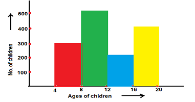
Histogram- The histogram is the special case of a bar diagram, it is the bar diagram without a gap between successive rectangle.it is shown by the rectangles of certain height and width. Its height is directly proportional to the frequency and width is the gap between two observations called class interval in such a way that for next rectangle the higher limit of the previous rectangle is the lower limit for the next rectangle.
Example. Show the following information through a histogram.
| The age group | 4 – 8 | 8 – 12 | 12 – 16 | 16 – 20 |
| No.of children in school | 300 | 500 | 200 | 400 |
Frequency Polygon –The frequency polygon is one of the ways of showing the frequency distribution of data. In this way, the frequency of data is shown along the y-axis and the class interval of observations are allocated along the x-axis. After doing this mark the midpoints of class interval called class mark. Mark out the corresponding frequency to each class mark in the graph, join all the points through a straight line, the graph obtained is known as a frequency polygon.
Frequency Curve. If frequency polygon is drawn by the smooth hand then the graph so formed is known as the frequency curve.
Frequency polygon can be drawn with the histogram and without histogram, with the histogram, the midpoints of the width of each rectangle are joined together and thus the graph shown by straight lines so formed is known as a frequency polygon.

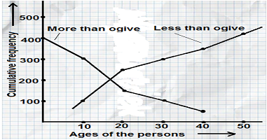
Ogive –This is the graph in which cumulative frequencies are shown along the y-axis and class intervals shown along the x-axis. The ogive shows the frequencies distribution under a curve or above a curve known as give. The ogive is of two kinds (a) More than ogive (b) Less than ogive.
| Ages of persons in a village | 0 – 10 | 10 – 20 | 20 – 30 | 30 – 40 | 40 – 50 |
| Number of persons | 100 | 150 | 50 | 50 | 50 |
| Ages of persons in a village | Frequency | Cumulative frequency | |
| More than | Less than | ||
| 0-10 | 100 | 100 | 400 |
| 10-20 | 150 | 250 | 300 |
| 20-30 | 50 | 300 | 150 |
| 30-40 | 50 | 350 | 100 |
| 40-50 | 50 | 400 | 50 |
Most popular mobile phones in Amazon: click here
NCERT Solutions for class 9 maths
NCERT Solutions for class 9 science
NCERT Solutions for class 10 maths
CBSE Class 10-Question paper of maths 2021 with solutions
CBSE Class 10-Half yearly question paper of maths 2020 with solutions
CBSE Class 10 -Question paper of maths 2020 with solutions
CBSE Class 10-Question paper of maths 2019 with solutions
NCERT Solutions for Class 10 Science
NCERT Solutions for class 11 maths
| Chapter 1-Sets | Chapter 9-Sequences and Series |
| Chapter 2- Relations and functions | Chapter 10- Straight Lines |
| Chapter 3- Trigonometry | Chapter 11-Conic Sections |
| Chapter 4-Principle of mathematical induction | Chapter 12-Introduction to three Dimensional Geometry |
| Chapter 5-Complex numbers | Chapter 13- Limits and Derivatives |
| Chapter 6- Linear Inequalities | Chapter 14-Mathematical Reasoning |
| Chapter 7- Permutations and Combinations | Chapter 15- Statistics |
| Chapter 8- Binomial Theorem | Chapter 16- Probability |
CBSE Class 11-Question paper of maths 2015
CBSE Class 11 – Second unit test of maths 2021 with solutions
NCERT solutions for class 12 maths
| Chapter 1-Relations and Functions | Chapter 9-Differential Equations |
| Chapter 2-Inverse Trigonometric Functions | Chapter 10-Vector Algebra |
| Chapter 3-Matrices | Chapter 11 – Three Dimensional Geometry |
| Chapter 4-Determinants | Chapter 12-Linear Programming |
| Chapter 5- Continuity and Differentiability | Chapter 13-Probability |
| Chapter 6- Application of Derivation | CBSE Class 12- Question paper of maths 2021 with solutions |
| Chapter 7- Integrals | |
| Chapter 8-Application of Integrals |
Class 12 Solutions of Maths Latest Sample Paper Published by CBSE for 2021-22 Term 2
Class 12 Maths Important Questions-Application of Integrals
Solutions of Class 12 Maths Question Paper of Preboard -2 Exam Term-2 CBSE Board 2021-22
Solutions of class 12 maths question paper 2021 preboard exam CBSE Solution


